Fascinating size-comparison maps reveal how huge nations REALLY are
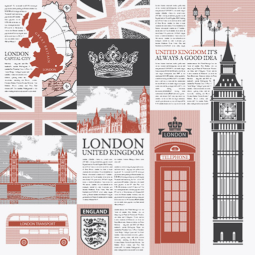
Brits may feel that getting from one end of their country to another is a long-distance haul.
But their perspective on the matter might change if they use the fascinating size-comparison map tool by mylifeelsewhere.com, which enables users to place maps of countries and continents directly over other landmasses to discover how big they really are.
Using this tale-of-the-tapes function, it turns out that Britain is a tiddler on the international circuit – slightly smaller than the state of California and dwarfed by the United States as a whole.
The U.S, in turn, looks much diminished when placed over Africa.
And India, which looms large on the Asian subcontinent, doesn’t look quite so impressive when positioned over mighty Canada.
Scroll down for a geography lesson like no other.
Europe vs Africa

Africa is around 30,365,000 sq km, making it three times bigger than Europe (10,180,000 sq km)
Europe vs USA

Europe (10,180,000 sq km) is bigger than the U.S (9,833,517 sq km), but only by four per cent
Australia vs Africa

Australia covers 7,741,220 sq km – but Africa covers a whopping 30,365,000 sq km, making it 3.9 times bigger
USA vs China

America is the world’s No.1 economy, with China in second place. But does America also trump China for size? Just. China covers 9,596,960 sq km while the U.S is 9,833,517 sq km. So the United States is two per cent larger. However, 1.1billion fewer people live in the United States, which has a population of 333million compared to China’s 1.4billion
USA vs UK

The United States (9,833,517 sq km) is about 40 times bigger than the United Kingdom (243,610 sq km), with 269million more people living there
UK vs California

California is about 1.7 times bigger than the United Kingdom, with the former covering 403,882 sq km
UK vs Australia

Australia is huge – covering 7,741,220 sq km. This makes it 32 times bigger than the UK
Greenland vs USA

Greenland in reality is slightly smaller than it appears on many maps – though it’s still huge, covering 2,166,086 sq km. What this looks like in comparison to the U.S is shown above, with the latter 354 per cent bigger. Population-wise, the contrast is extreme, with just 57,000 people living in Greenland
India vs Africa

India (3,287,263 sq km) looms large on the Asian sub-continent, but it’s swamped by Africa, which is nine times bigger
Africa vs USA

While America is colossal, it’s no match for the continent of Africa, which is 3.1 times bigger
Russia vs USA

Russia is vast, covering 17,098,242 sq km, making it 1.7 times bigger than the United States (shown here minus Alaska)
USA vs Canada

Canada (9,984,670 sq km) is slightly bigger than its southern, more boisterous neighbour, with the U.S 98.49 per cent the size
USA vs Australia

Australia is 78.72 per cent the size of the United States, or 1.3 times smaller
Canada vs India

Canada is 204 per cent larger than India, though there are 1.4billion fewer people there
UK vs India

India (3,287,263 sq km) is 13 times bigger than the United Kingdom (243,610 sq km). However, almost 1.3billion more people live in India, which has a population of around 1.4billion, compared to the UK’s 68million
Brazil vs UK

Brazil (8,515,770 sq km) is about 35 times bigger than the United Kingdom
Brazil vs USA

It’s a draw – almost: Brazil is 86.6 per cent the size of the United States, but 120.1million fewer people live in Brazil
MyLifeElsewhere reveals that it uses the Mercator projection to display maps. It’s ‘the most widespread projection used in cartography’, but means that some areas become distorted near the poles.